
Outcomes
The Anglesea Corporate Finance Website: Designing for Trust, Clarity and Expertise
A look behind the scenes at 2xN’s website design for Anglesea Corporate Finance, creating a professional and intuitive digital experience that clearly communicates its specialist services, extensive experience and hands-on approach.
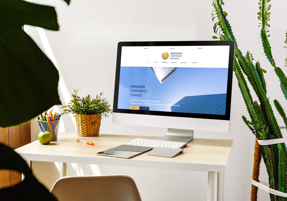
When Anglesea Corporate Finance approached us, they had a clear challenge. They're brilliant at what they do: guiding business owners through mergers, acquisitions and strategic exits. But their existing site didn't reflect that brilliance. It felt cluttered, hard to navigate and didn't quite convey the depth of expertise they bring to every deal.
Corporate finance website design isn't like designing for consumer brands. You're not selling trainers or holidays. You're building trust with people making some of the biggest decisions of their professional lives. That means every detail counts.
Understanding the corporate finance website design brief
Right from the start, we knew this project needed to balance credibility with clarity. Anglesea's clients are business owners, often facing complex transactions for the first time. They need reassurance that they're in safe hands, but they also need to understand what Anglesea actually does.
We started by mapping out the user journey. What questions does a potential client have when they land on the site? How do they decide whether to pick up the phone? Through conversations with the Anglesea team, we identified three core goals: communicate expertise, simplify complex services and make it easy to get in touch.
Our website design and build process always begins with research. We reviewed competitor sites, studied industry norms and identified what worked (and what didn't). Most corporate finance websites lean heavily on jargon. They assume you already know what 'buy-side advisory' means. We wanted to do better.
Structuring content for clarity and trust
Corporate finance is dense. There are different services, different deal types and different client needs. The old site tried to cover everything at once, and it ended up overwhelming visitors instead of guiding them.
We simplified the structure around clear user paths. If you're selling your business, here's what Anglesea does. If you're acquiring another company, here's the support you'll get. We created dedicated service pages with straightforward explanations and real-world examples.
Think of it like organising a toolkit. You don't throw every spanner, screwdriver and drill bit into one drawer. You group things logically so you can find what you need when you need it. That's what we did with the content.
Strong content writing was essential here. We worked closely with Anglesea to translate technical processes into language that business owners actually use. No fluff, no corporate speak. Just clear explanations of how they help and why it matters.
Designing for professionalism without losing personality
Here's the tricky bit with corporate finance website design: you need to look credible without feeling cold. This isn't a faceless institution. Anglesea is a small, experienced team who work hands-on with every client. We wanted the design to reflect that.
We chose a clean, modern layout with plenty of white space. Typography is sharp and professional. The colour palette is restrained but confident. Every element reinforces the idea that Anglesea knows what they're doing.
But we also made sure the team's personality came through. Real photos of the advisers, not stock images of people in suits shaking hands. Case studies written in a human voice. Testimonials from actual clients talking about their experience. According to research by Nielsen Norman Group, users connect more deeply with authentic content that feels genuine.
Making navigation intuitive and goal-focused
You can have the best content in the world, but if people can't find it, it's worthless. Navigation on the Anglesea site needed to be dead simple.
We implemented a clear top-level menu: Services, About, Insights and Contact. Within Services, we created logical sub-categories that match how clients think, not how the industry categorises things. Instead of hiding everything behind dropdown menus, we used a clean mega-menu approach that shows options at a glance.
Every page also includes clear calls to action. Whether it's booking a consultation or downloading a sector guide, the next step is always obvious. Our approach to SEO meant optimising these pathways so potential clients could find Anglesea through search as well as direct visits.
Ensuring performance and accessibility
A beautiful site that takes ten seconds to load is useless. Speed matters, especially when you're trying to establish trust. We optimised every image, streamlined the code and ensured the site loads fast on mobile and desktop alike.
Accessibility was equally important. Corporate finance website design shouldn't exclude anyone. We made sure colour contrast meets WCAG standards, navigation works with keyboard controls and content is structured properly for screen readers.
Mobile performance deserves special attention. More business owners are researching advisers on their phones than ever before. The site needed to work flawlessly on smaller screens, with touch-friendly buttons and readable text that didn't require zooming.
Building for ongoing growth and updates
Anglesea didn't just need a site that looked good on launch day. They needed something they could grow with. We built the site on a flexible platform that makes it easy for them to add new case studies, publish insights and update service details without needing a developer every time.
Our services include training and support, so the Anglesea team felt confident managing content themselves. We created a simple style guide to keep everything consistent as the site evolves.
We also integrated analytics properly from the start, so they can see what's working. Which pages get the most traffic? Where do people drop off? What content leads to enquiries? Data like this helps refine the site over time.
Reflecting expertise through every detail
The result is a corporate finance website design that does exactly what it needs to do. It communicates Anglesea's expertise clearly. It makes complex services understandable. It builds trust without feeling stuffy. And it makes it genuinely easy for the right clients to get in touch.
Every choice, from the typography to the page structure, reinforces the same message: Anglesea Corporate Finance knows this world inside out, and they'll guide you through it with clarity and care. That's what good website design does. It doesn't just look professional. It works.
Ready to talk about your project?
Start a conversation →