
Outcomes
2xN Across the Atlantic: Designing a Digital Experience as Bold as Michelle Boudreau Design
2xN reimagined the website for Los Angeles-based interior designer Michelle Boudreau as an immersive digital extension of her signature aesthetic: bold, artful and unmistakably sophisticated. Inspired by Michelle’s ability to balance architectural forms with unexpected materials, colours, cultural influences and surreal details, the redesigned website was crafted to feel as considered and visually striking as the spaces she creates. Every element was designed to create intrigue while maintaining an effortless sense of usability, allowing her portfolio and distinctive creative vision to take centre stage. The result is a refined, high-impact digital experience that captures the spirit of Michelle’s work and brings her distinctive vision of curated modernism to life online.
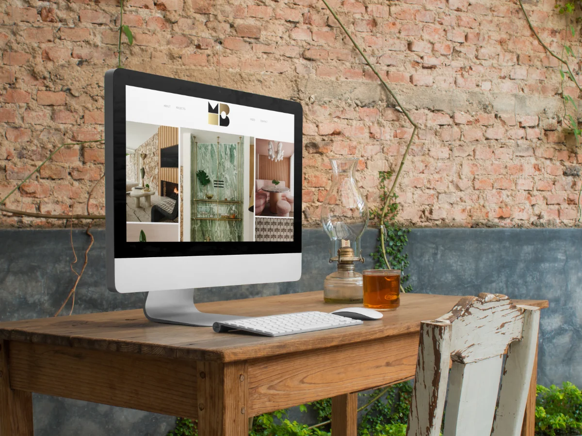
When you're working with a designer whose interiors stop you in your tracks, the website can't be an afterthought. Michelle Boudreau creates spaces that blend architectural rigour with unexpected touches: a pop of colour here, a cultural reference there, materials you didn't see coming. Her Los Angeles studio is known for curated modernism that feels both bold and inviting. So when it came to her digital presence, we knew the bar was high.
The brief was clear. Create a digital experience design that doesn't just show her work, but feels like it. Think of it as designing a gallery space: the lighting matters, the sightlines matter, the way you move through it matters. You want people to linger, to notice details, to understand the vision behind each project. That's what we set out to build.
Understanding the Creative Vision First
Before we touched a wireframe, we spent time understanding what makes Michelle's work distinctive. Her interiors aren't minimal for the sake of it. They're considered. Every material choice, every colour decision, every piece of art has a reason for being there. You see architectural forms paired with surreal details. You see restraint balanced with moments of surprise.
That approach needed to translate online. So we studied her portfolio. We talked through her process. We looked at how her clients experience her spaces in real life. And then we asked ourselves: how do you capture that feeling in a website? How do you make someone scrolling on their phone feel the same intrigue they'd feel walking into one of her finished projects?
Building a Digital Experience Design That Reflects Her Aesthetic
The structure came first. We needed a site that let her work breathe. Large, high-quality images. Plenty of white space. Clean typography. Nothing competing for attention. It's the same principle Michelle uses in her interiors: give every element room to shine.
But we didn't want sterile. We wanted bold. So we introduced movement. Subtle animations that guide your eye. Transitions that feel intentional, not flashy. Layouts that shift as you scroll, keeping you engaged without overwhelming you. Think of it like walking through a well-designed home: there's a natural flow, and each room reveals something new.
Colour was another key piece. Michelle isn't afraid of a statement. Neither were we. We used her brand palette strategically, letting bold hues punctuate the experience without dominating it. You get moments of impact, then you get calm. It's a rhythm that mirrors her design philosophy.
Portfolio as the Centrepiece
Her work had to take centre stage. We built a portfolio layout that's easy to navigate but never feels formulaic. Each project gets its own space to unfold. You see the hero shot, then you scroll through details. Materials, textures, the way light plays across a room. We wanted you to experience the projects, not just glance at them.
And because Michelle's clients often want to see process as much as finished product, we made sure there was room for storytelling. Context matters. When you understand the brief, the site, the client's vision, the finished space makes more sense. That depth is what separates a portfolio from a brochure.
Usability Without Compromise
Here's the thing about bold design: it only works if it's usable. You can have the most stunning visuals in the world, but if someone can't find what they need, you've lost them. We obsessed over navigation. Every click had to feel intuitive. Every page had to load fast. Every image had to be optimised without sacrificing quality.
We tested the site on every device we could get our hands on. Mobile, tablet, desktop. Different browsers. Different screen sizes. Because Michelle's audience might be browsing on a phone during their commute or reviewing her work on a large monitor in their office. The website design and build needed to adapt seamlessly.
Accessibility mattered too. Contrast ratios, focus states, screen reader compatibility. A sophisticated digital experience design isn't just for people who can see it perfectly on the latest device. It's for everyone. And when you get the fundamentals right, the site feels better for all users, not just some.
SEO and Discoverability Built In
Michelle's work deserves to be found. So we didn't treat SEO as an afterthought. From the start, we structured the site with search visibility in mind. Clean code. Semantic HTML. Proper heading hierarchy. Fast load times. All the things that search engines love, but that also happen to make for a better user experience.
We wrote metadata that reflected her brand voice. We optimised images with descriptive alt text. We made sure internal linking flowed naturally, guiding both users and search crawlers through the site.
Collaboration Across Time Zones
Working with a client in Los Angeles when you're based in the UK has its challenges. Time zones mean you're not always on calls together. Feedback loops take longer. Decisions can't always be made in real time. But it also has advantages. You get thinking time. You get space to refine ideas without the pressure of an immediate response.
We leaned into asynchronous collaboration. Detailed briefs. Visual mockups. Video walkthroughs. We used tools that let Michelle see the site evolve in real time, leave comments, mark up designs. It meant fewer meetings, but better meetings. When we did connect live, we were discussing big-picture strategy, not minor tweaks.
And we built trust through transparency. Michelle could see progress at every stage. Nothing was hidden behind a curtain until the big reveal. That openness made the process smoother, even across thousands of miles.
A Digital Home That Matches the Work
The finished site feels like Michelle. It's confident without being showy. It's immersive without being overwhelming. It's sophisticated without being cold. When you land on the homepage, you know immediately what kind of designer you're looking at. And when you explore the portfolio, you get a real sense of her range and her point of view.
That's what great digital experience design does. It doesn't just display information. It communicates who you are. It sets a tone. It makes people want to stay, to explore, to reach out. For creative professionals like interior designers, your website is often the first space a potential client experiences. It needs to make them feel something.
We're proud of what we built for Michelle. But more importantly, she has a platform that truly represents her work. One that scales as her studio grows. One that connects with the right clients. One that brings her vision of curated modernism to life online, no matter where in the world someone's viewing it from.
Why Digital Experience Design Matters for Creative Businesses
If you're in a creative field, your website isn't a nice-to-have. It's a critical part of your brand. It's where people go to decide if they want to work with you. It's where your aesthetic needs to come through loud and clear. And it's where usability and beauty need to coexist.
You wouldn't design a physical space without thinking about flow, lighting and materials. The same rigour should apply to your digital presence. Every colour choice, every font, every animation should serve a purpose. According to research from Nielsen Norman Group, users form opinions about your site in milliseconds. You don't get a second chance at that first impression.
That's where content writing, app development and Google Ads all intersect with design. A beautiful site is just the start. You need words that resonate. You need functionality that works. You need a way for people to find you. At 2xN, we think about all of it as one cohesive system, not separate boxes to tick.
Michelle Boudreau Design now has a digital experience that matches the quality of her interiors. And if you're ready to create something equally bold for your own brand, we'd love to talk. Head to our services page to see how we work, or contact us to start a conversation. Your digital presence should be as distinctive as the work you do. Let's make sure it is.
Ready to talk about your project?
Start a conversation →