
Outcomes
Where Interior Design Meets Digital Design: Anna Auzins Interiors
A look behind the scenes at 2xN’s website redesign for Anna Auzins Interiors, creating a refined, inspiring digital experience that reflects Anna’s distinctive approach to interior design, showcases her portfolio and makes it easier for clients to explore her services and process.
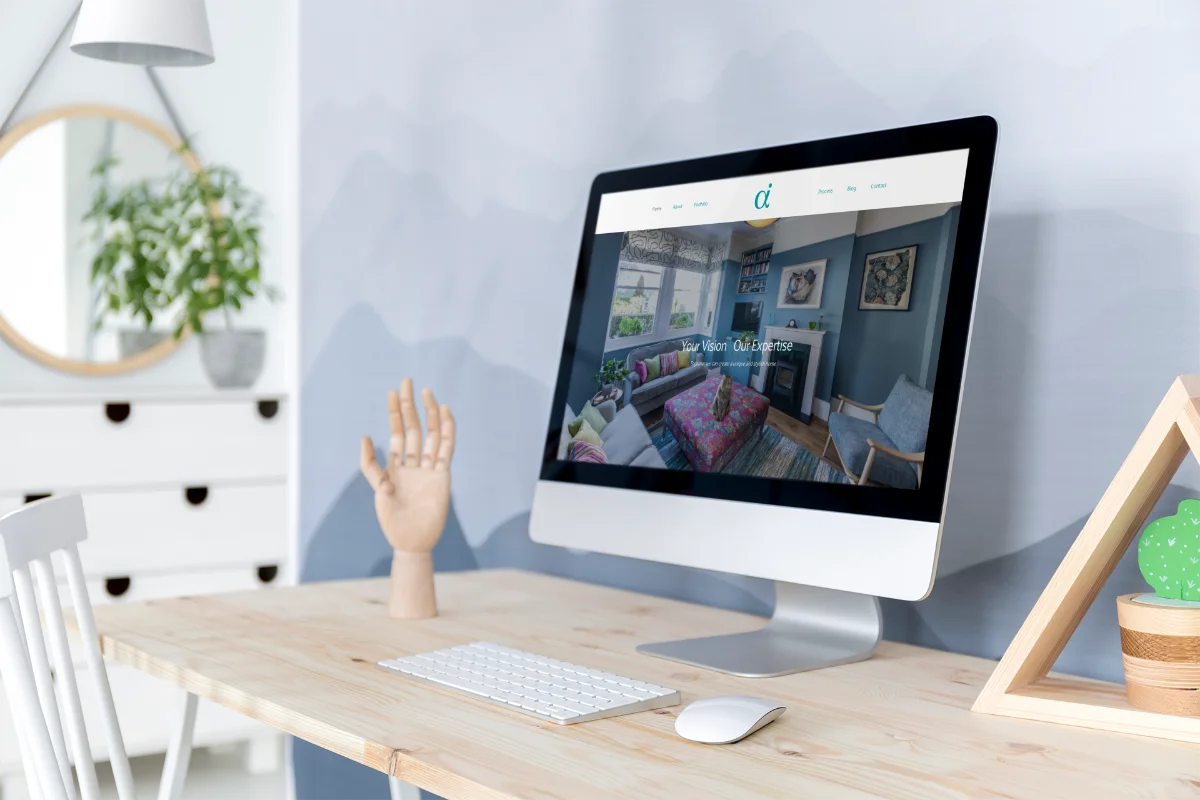
Your website is your digital showroom. For an interior designer, it needs to do what every carefully curated space does: tell a story, evoke emotion and make people want to stay awhile. That was the brief when Anna Auzins Interiors came to us for a website design and build that would match the sophistication of her work.
Why an interior design website needs more than pretty pictures
You might think a designer's website just needs a gallery. Click through some rooms, admire the lighting, done. But that misses the point entirely.
Anna's clients aren't just browsing for inspiration. They're looking for someone who understands their vision, respects their budget and can guide them through a process that feels anything but straightforward. The interior design website had to communicate all of that before anyone even picked up the phone.
We started by mapping out the client journey. What questions would someone have at each stage? How could we answer them without overwhelming the page? Think of it like designing a room: every element needs purpose, and clutter kills the mood.
Building a portfolio that does the talking
Anna's portfolio is stunning. Our job was to let it breathe.
We created a layout that showcases each project with generous imagery and thoughtful context. No endless scrolling through tiny thumbnails. No busy sidebars competing for attention. Just beautiful spaces, presented with the care they deserve.
Each project page includes the story behind the design, the client's brief and how Anna approached it. That narrative matters. According to Nielsen Norman Group research, users read only about 20% of the text on a page, so every word had to earn its place.
We also made sure the interior design website worked flawlessly on mobile. More than half of web traffic now comes from phones, and you don't want potential clients pinching and zooming their way through your portfolio. That's a fast track to the back button.
Making the process feel approachable
Interior design can feel intimidating if you've never worked with a designer before. Where do you start? What will it cost? How long does it take?
We built a dedicated services section that breaks down Anna's process into clear, digestible steps. No jargon. No assumptions. Just straightforward information that helps clients understand what to expect.
This kind of transparency builds trust. You're not hiding behind vague promises or making people contact you just to get basic information. You're showing up as helpful from the very first click, which is exactly how Anna approaches her client relationships.
Creating a brand experience, not just a brochure
The best interior design website doesn't just display work. It creates an experience that reflects the designer's aesthetic and values.
For Anna, that meant a refined, minimal design with plenty of white space, elegant typography and a restrained colour palette. Every design choice reinforced her brand: thoughtful, sophisticated, timeless.
We also focused heavily on SEO from the ground up. Beautiful design is wasted if no one can find you. Strategic keyword research, optimised imagery and well-structured content writing all worked together to make sure Anna's site would rank for the searches that matter.
According to Google Search Central guidelines, page experience and quality content are critical ranking factors. We built both into the foundation of the site.
The details that make the difference
Small touches matter. A lot.
We added smooth transitions between pages, so navigation feels seamless rather than jerky. We optimised image loading times, because even a second's delay can increase bounce rates. We made sure every button, every link and every form worked exactly as expected.
These aren't flashy features. They're invisible when they work well, which is precisely the point. You notice bad user experience immediately. Good user experience just feels effortless.
What we learned from this project
Working with Anna reminded us that every industry has its own language, its own priorities and its own version of what 'success' looks like online.
For an interior design website, success isn't just traffic numbers or conversion rates. It's about attracting the right clients, the ones who appreciate Anna's approach and are ready to invest in her process. Quality over quantity, every time.
The site needed to filter as much as it welcomed. Show enough to inspire, explain enough to reassure, but remain selective about who it speaks to. That's a delicate balance, but it's one worth striking.
If your website feels like it's working against your business rather than for it, that's a sign. Your digital presence should reflect the care and expertise you bring to your work. It should make things easier for your clients, not harder. And it should feel like you, not a template someone else filled in.
That's what we built for Anna Auzins Interiors. A digital space as considered and beautiful as the physical ones she creates.
Ready to talk about your project?
Start a conversation →