
Outcomes
A Fresh New Digital Home for Expert Neurological Care
2xN redesigned Paul Worth's website who is a specialist in Neurological care, creating a fresh, modern digital presence that reflects the expertise, professionalism and specialist care at the heart of the service.
The new website combines a clean, accessible design with clear messaging and intuitive navigation, making it easier for patients, families and healthcare professionals to understand the services available and find the information they need. The result is a more engaging and credible online experience that brings Paul Worth's practice to life.
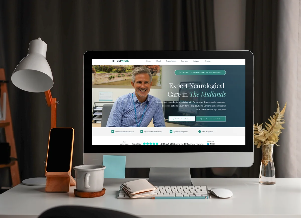
When you're offering specialist neurological care, your website needs to reflect the same level of expertise and professionalism you bring to patient care. That was the challenge facing Paul Worth. Their old site wasn't doing them justice. It didn't capture the warmth, clarity and reassurance patients needed when searching for neurological care website support.
So we rolled up our sleeves and got to work.
Understanding what patients really need
Healthcare websites are tricky. You need to balance clinical authority with genuine warmth. Too formal and you feel distant. Too casual and you lose credibility. Finding that sweet spot takes real understanding of your audience.
We started by thinking about the people visiting the site. Patients looking for answers. Worried families trying to understand complex conditions. GPs seeking specialist referral information. Each group arrives with different questions, different anxieties, different needs.
Your neurological care website has to serve them all, and serve them well.
Creating clarity through clean design
The old site was cluttered. Information was hard to find. The design felt dated. Visitors couldn't quickly grasp what services were available or how to access them. That creates friction exactly when people need simplicity most.
We stripped everything back. Clean lines. Plenty of white space. Clear headings that guide you through each section. Think of it like decluttering a room: suddenly you can breathe, you can think, you can find what you need without frustration.
Our approach to website design and build always puts user experience first. For Paul Worth, that meant making complex medical information feel approachable without dumbing it down. Patients deserve respect and clarity in equal measure.
Navigation that actually makes sense
Ever landed on a healthcare site and felt lost within seconds? We've all been there. Poor navigation is more than annoying when you're dealing with health concerns. It's genuinely stressful.
We rebuilt the site structure from the ground up. Services are clearly categorised. Each page has a single, focused purpose. You know where you are, where you've been, and where you can go next. No mystery clicks. No dead ends.
According to research from the Nielsen Norman Group, clear navigation is one of the most critical factors in website usability. When you're already worried about a health condition, confusing menus just add unnecessary anxiety.
Professional neurological care website messaging that connects
Medical websites often fall into jargon traps. They explain conditions using language only other clinicians understand. That creates barriers when you should be building bridges.
We worked closely with Paul to translate clinical expertise into plain English. Not simplified. Not patronising. Just clear, respectful language that helps patients and families understand what's happening and what help is available.
Our content writing process involves multiple rounds of refinement. We test readability. We check comprehension. We make sure every sentence earns its place. The goal is always communication, not decoration.
Accessibility baked in from the start
Healthcare websites must be accessible to everyone. That's not just good practice, it's an ethical requirement. People with visual impairments, motor difficulties or cognitive challenges deserve equal access to health information.
We built Paul's site following WCAG accessibility guidelines. Proper heading structure. Alt text on every image. Sufficient colour contrast. Keyboard navigation throughout. Screen reader compatibility tested and verified.
These features help everyone, not just people with specific needs. Clear headings help you scan. Good contrast reduces eye strain. Keyboard navigation speeds up browsing for power users. Accessibility makes better websites full stop.
Building credibility through thoughtful neurological care website design
Trust matters enormously in healthcare. You're making decisions that affect your wellbeing or that of someone you love. The website experience shapes whether you feel confident moving forward.
We used design choices deliberately to build that confidence. Professional photography. Consistent typography. Careful colour choices that feel calm and reassuring. Everything signals competence and care.
But credibility isn't just about looking good. It's about functioning properly too. Fast loading times. Mobile responsiveness. No broken links. These technical details tell visitors you're thorough, you're professional, you pay attention.
Making the neurological care website work harder
A beautiful website that nobody finds is just expensive digital wallpaper. We built SEO foundations into every page, helping people discover Paul Worth when they search for the specialist help they need.
Strategic keyword placement. Optimised meta descriptions. Proper heading hierarchy. Internal linking that guides both users and search engines. All the technical elements that help you rank without compromising the human experience.
We also integrated Google Ads capability, giving the practice options for reaching people actively searching for neurological care services in their area.
The result: a digital presence that does justice to the expertise
Paul's new website feels like what it is: a professional, specialist service delivered with genuine care. Visitors can find information quickly. They understand the services available. They feel reassured by the expertise on offer.
Paul and his team now have a digital home that matches their clinical standards. It welcomes patients, informs families, and supports healthcare professionals making referrals. It works on every device, loads quickly, and presents information with clarity and warmth.
That's what thoughtful neurological care website design should do. It should remove barriers. Build confidence. Make complex information accessible. And ultimately help people get the expert care they need, exactly when they need it most.
Ready to talk about your project?
Start a conversation →