
Outcomes
Suks Minhas – A Distinctive Identity. A Stronger Digital Presence.
Following our work with Tet Yap, we also created a complementary online presence for his colleague, Suks Minhas, carrying forward the same clean, contemporary design approach and cohesive visual language.
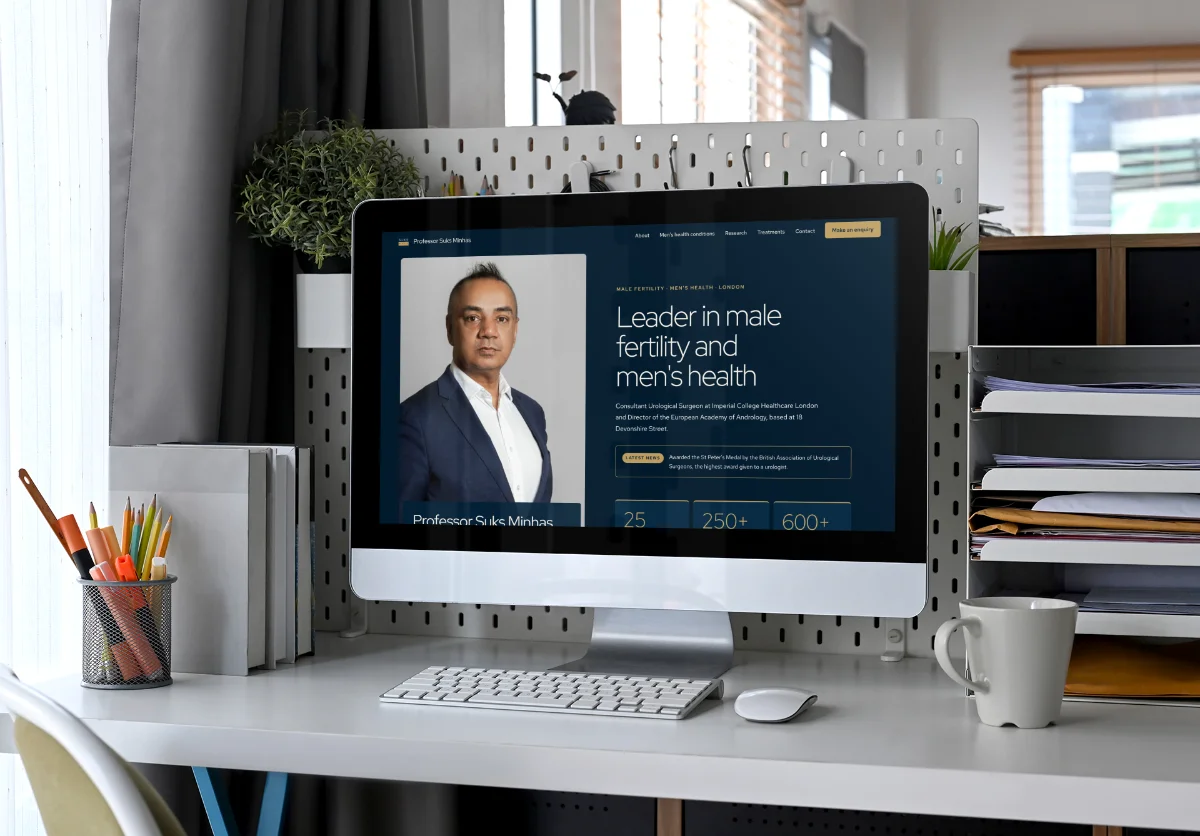
You know that feeling when you walk into someone's home and everything just works? Nothing matches exactly, but there's a thread running through it all. That's what we aimed for here. A complementary digital identity that sits naturally alongside Tet Yap's website whilst giving Suks his own space to shine.
The Challenge of Complementary Digital Identity
Here's the thing. When you're building a website for someone whose colleague already has one, you're walking a tightrope. Too similar and it looks like a copy-paste job. Too different and the connection disappears entirely.
Suks needed his own professional presence. His own voice. His own identity. But he also wanted visitors moving between the two sites to feel that sense of coherence. Like they'd stepped from one room into another in the same beautifully designed house.
That's where website design and build becomes more art than science. You're not just creating pages. You're creating a relationship between two digital spaces.
Building a Shared Design Vision
We started with what we'd already established for Tet. Clean lines. Contemporary feel. Sophisticated but never stuffy. Then we asked ourselves how those principles could flex to accommodate someone else's personality.
Think of it like siblings. Same parents, same upbringing, but completely different people. That's what we were after. A complementary digital identity that felt related without being identical.
Typography played a huge role here. We carried forward the same font families but adjusted weights and spacing to give Suks' site its own rhythm. Same alphabet, different conversation. According to W3C accessibility guidelines, thoughtful typography choices also improve readability across devices, which mattered enormously for both sites.
Maintaining Individual Identity Within Unity
You can't fake authenticity. We knew that going in. So whilst the design language stayed consistent, everything else needed to reflect Suks as an individual.
The messaging shifted. The tone adjusted. The imagery told a different story. We focused on content writing that captured his professional approach without borrowing from Tet's voice.
Colour became our secret weapon. We kept the palette related but introduced subtle shifts that gave each site its own temperature. Warm versus cool. Energetic versus calm. Small changes that make a big difference when you're creating a complementary digital identity.
Refined Layouts and Intuitive Navigation
Here's where user experience gets interesting. Both sites needed to feel intuitive, but they also needed to accommodate different content structures and professional focuses.
We built refined layouts that shared underlying grid systems but expressed them differently. Same bones, different posture. That meant someone familiar with Tet's site would instinctively know how to navigate Suks' site, even though the pages themselves had their own character.
Navigation followed the same logic. Clear. Straightforward. No hunting for information. We applied the same principles we use for every SEO project: if people can't find it, it might as well not exist.
Research from Nielsen Norman Group shows users form opinions about websites in milliseconds. That first impression matters. We made sure both sites delivered that instant sense of polish and professionalism.
Technical Execution and Performance
Beautiful design means nothing if the site crawls. We built both platforms with performance baked in from the start. Fast loading times. Optimised images. Clean code that search engines love.
Mobile responsiveness wasn't an afterthought. It was the foundation. More than half your visitors will arrive on phones. Both sites needed to look stunning and work flawlessly regardless of screen size.
We also ensured the technical infrastructure supported the complementary digital identity we'd created. Consistent services delivery across both projects meant neither site felt like the practice run.
The Result: Two Sites, One Vision
What we delivered was exactly what we set out to create. Two distinct professional presences that feel naturally connected. You can visit either site and immediately understand the relationship without feeling like you're seeing double.
Suks now has a polished digital home that stands on its own merits whilst complementing Tet's online presence. The websites demonstrate how individual personalities can coexist within one cohesive creative direction.
That's the power of thoughtful design. You don't have to sacrifice individuality for consistency. You don't have to choose between unity and identity. With the right approach, you can have both. And that's exactly what makes this project special. It proves that complementary digital identity isn't about matching. It's about harmony.
Ready to talk about your project?
Start a conversation →