
Outcomes
Tet Yap – A Fresh Perspective. Smarter Search. Refined Digital Presence.
We revisited our existing work with Tet Yap to give the website a much-needed refresh, bringing its design, content and functionality up to date while retaining the simplicity of its original single-page concept.
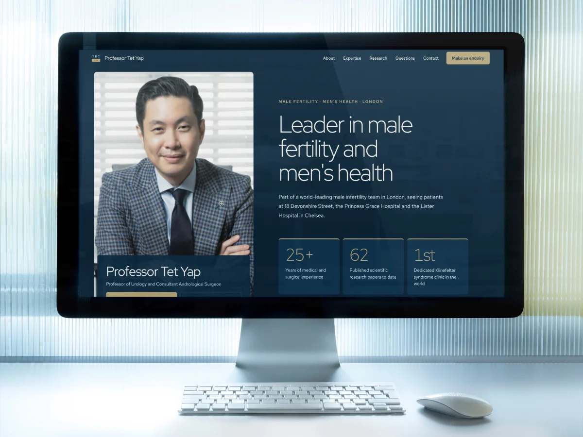
You know that feeling when you look at something you created a while back and think, 'this is good, but it could be better'? That is exactly where we found ourselves with Tet Yap. The original website design worked well. It did the job. But websites, like everything else, need a bit of love now and then.
We built Tet Yap's single-page website to keep things simple and streamlined. One page, all the essentials, no fuss. That approach still made sense. The challenge was taking what already existed and making it feel fresh, modern and more intuitive without throwing out what worked in the first place.
Why a website refresh matters
Websites age faster than you might think. Design trends shift. User expectations evolve. What felt slick three years ago can start to look tired today. You are not redesigning from scratch, you are polishing what is already there.
A website refresh is about refinement. It is taking the bones of something solid and bringing it up to date. Better visuals, clearer messaging, smoother navigation. You keep the core intact while improving everything around it.
For Tet Yap, that meant keeping the single-page concept but rethinking how visitors moved through the content. We wanted the experience to feel lighter, easier and more engaging. Think of it like redecorating a room you love: same space, better furniture, fresher paint.
Reworking the single-page website layout
Single-page websites are brilliant when done right. Everything lives in one place, and visitors scroll through a story rather than clicking around separate pages. But they can also feel overwhelming if the structure is not clear.
We revisited the layout with one goal: make it easier to scan, explore and understand. That meant breaking up dense sections, adding breathing room and creating a more logical flow from one piece of content to the next.
The content writing got tightened up too. Sharper headlines, punchier messaging and a tone that felt more conversational. You should never have to work hard to understand what a website is telling you. If someone lands on your page and feels lost, they will leave. Simple as that.
Adding AI-powered search for smarter navigation
Here is where things got interesting. Traditional navigation works fine for multi-page websites, but on a single-page site, you need something different. Visitors should not have to scroll endlessly to find what they need.
We integrated AI-powered search functionality, giving visitors a smarter way to explore the content. Type in a question or keyword, and the search pulls up the most relevant section instantly. No guesswork, no frustration.
AI search is not just a nice-to-have anymore. It is becoming expected. According to Google Search Central, users want instant, relevant answers, and intelligent search helps deliver that. For a single-page website, it is a game-changer.
This kind of functionality works particularly well when you pair it with good SEO. The search needs quality content to pull from, so the two go hand in hand. You build a strong foundation with well-structured content, then layer on smart search to help people navigate it.
Design updates that improve the user experience
A website refresh is not just about what you add. It is also about what you take away. We stripped back unnecessary elements, simplified the colour palette and gave the typography more room to breathe.
Visual hierarchy matters. You want visitors to know where to look first, second and third. We used spacing, contrast and layout to guide the eye naturally down the page. Every section felt distinct but connected.
Usability on mobile got special attention too. More than half of web traffic comes from mobile devices, according to Statista, so the experience on a smaller screen has to be just as good, if not better. We tested every interaction, every button, every scroll to make sure it worked smoothly.
Good design does not shout. It just works. You should not notice it because everything feels intuitive. That was the bar we set for this website refresh.
Keeping the website refresh simple and effective
The beauty of working on an existing project is that you already know what the client needs. You have history, context and a relationship. That makes the process faster and more focused.
We did not need to reinvent the wheel. We took what was already strong about the Tet Yap website and made it stronger. Cleaner design, better structure, smarter functionality. No wasted effort, no unnecessary complexity.
If you are thinking about refreshing your own website, start by asking what is working and what is not. You do not always need a full rebuild. Sometimes a focused update delivers more value than starting from scratch.
A website refresh that builds on what works
The Tet Yap website refresh shows what happens when you take good work and give it room to grow. We kept the single-page simplicity, improved the design and usability, and added AI search to make navigation smarter.
It is a reminder that websites are never truly finished. They evolve alongside your business, your audience and the way people use the web. A refresh keeps you relevant without throwing away what already works.
Whether you need a full redesign or a targeted update, the goal stays the same: make it easier for your visitors to find what they need and enjoy the experience along the way. That is what a good website refresh should do. And that is exactly what we delivered for Tet Yap.
Ready to talk about your project?
Start a conversation →