
Outcomes
Vik Sharma – Website Redesign | Ophthalmology & Eye Care
We redesigned the website for Mr Vik Sharma, Consultant Ophthalmologist and Cataract & Glaucoma Specialist, creating a modern, professional online presence.
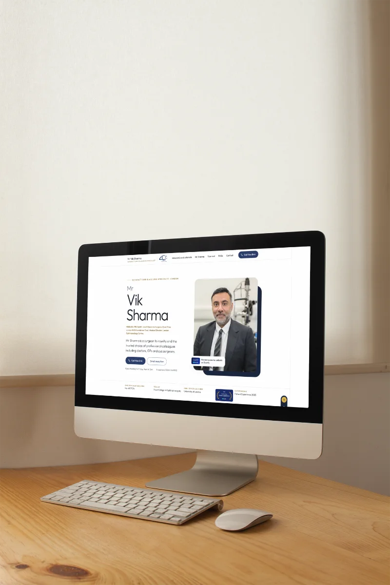
Why an ophthalmologist website redesign matters
Your website is often the first impression a patient gets. When you're a specialist in something as personal as eye health, that first glance carries weight. People aren't just looking for credentials. They want reassurance, clarity and a sense that you understand what they're going through.
Mr Vik Sharma is a Consultant Ophthalmologist with deep expertise in cataract and glaucoma surgery. His reputation speaks for itself. But his online presence needed to catch up with the level of care he provides. The brief was simple: create a site that feels professional, approachable and easy to navigate, without the clutter that so many medical websites fall into.
We tackled this ophthalmologist website redesign by stripping everything back to what matters most. One page. Clear sections. Information you can find in seconds.
The single-page approach
Multi-page websites have their place. But when your message is focused and your audience knows what they're after, a single-page layout makes absolute sense. You scroll, you find what you need, you're done. No hunting through menus or second-guessing which tab to click.
We structured the page around Mr Sharma's professional background, the services he offers, his clinical expertise and the patient experience he delivers. Each section flows naturally into the next. Visitors can jump straight to what they're looking for or read the whole story in one go.
This approach also works brilliantly on mobile. No pinching, no waiting for pages to load. Just smooth scrolling and instant answers. Given that more than half of all website design traffic now comes from phones, that matters more than ever.
AI-powered search that actually helps
Here's where the ophthalmologist website redesign got interesting. We integrated AI-powered search functionality so visitors can ask questions in plain English and get relevant answers straight away. Think of it as having a knowledgeable assistant on hand, ready to point you in the right direction.
Patients often arrive with specific concerns. They might not know the clinical term for what's worrying them, but they can describe it. The AI search picks up on that and surfaces the right information without making them wade through paragraphs of medical jargon. It's a small feature that makes a big difference to user experience.
We've seen this kind of intelligent functionality transform how people interact with websites. It removes friction, answers questions faster and builds trust. When someone feels understood, they're far more likely to reach out. Our app development work often includes similar intelligent features, tailored to the specific needs of each client.
Design that reflects expertise and care
Medical websites can feel cold. Sterile, even. That's the opposite of what patients need when they're looking for help with something as crucial as their eyesight. We wanted the design to feel calm, professional and human all at once.
The layout is clean and spacious. Typography is large and easy to read, because accessibility isn't optional when you're working in healthcare. Colour choices lean towards reassuring tones that don't distract from the content itself. Every design decision was made with the patient in mind.
We also made sure the site loads fast. According to research from Google, 53% of mobile users abandon a site if it takes longer than three seconds to load. Speed isn't just a technical detail. It's part of the experience. Our SEO work always emphasises performance, because a slow site hurts both rankings and conversions.
Content that connects
Good content writing in healthcare walks a fine line. You need to be authoritative without being intimidating. Detailed without being overwhelming. We worked closely with Mr Sharma to get the tone right across every section of the site.
His professional background is presented clearly, highlighting qualifications and experience without turning into a CV. The services section explains procedures in language that patients can understand, with enough detail to be informative but not so much that it feels dense. Clinical expertise is outlined in a way that builds confidence without resorting to unnecessary complexity.
Patient experience is front and centre throughout. People want to know what to expect, how they'll be looked after and why this particular consultant is the right choice for them. The content answers those questions directly, with empathy and clarity.
What this ophthalmologist website redesign achieved
The finished site does exactly what it set out to do. It presents Mr Vik Sharma's expertise in a way that feels accessible and reassuring. It helps patients find the information they need quickly, whether they're researching a specific procedure or looking for reassurance about their care. And it works beautifully across all devices, from desktop to mobile.
The AI-powered search adds a layer of intelligence that sets the site apart from typical medical websites. Visitors can ask questions naturally and get helpful answers without digging through dense content. That kind of thoughtful functionality makes all the difference when someone is anxious or uncertain.
From a technical standpoint, the site is fast, accessible and built to perform well in search. We followed best practices outlined by Google Search Central to ensure the site ranks well for relevant queries while maintaining a smooth user experience. Our Google Ads campaigns often complement organic search efforts, but in this case the focus was on creating a strong foundational presence.
Why this approach works for specialists
Single-page websites aren't right for every business. But for consultants, specialists and professionals with a focused message, they can be incredibly effective. You control the narrative. You guide the visitor through your story in the order that makes most sense. And you remove the barriers that can make people bounce before they've even started.
This ophthalmologist website redesign shows what's possible when you prioritise clarity, functionality and patient experience. Mr Sharma's expertise deserves a digital presence that matches it. Now he has one.
If you're looking to refresh your own professional website, or you're curious about how AI-powered features could improve the way visitors interact with your content, our services cover everything from strategy to launch. We'd love to hear what you're working on and explore how we can help. Get in touch through our contact page and let's talk about what's possible.
Ready to talk about your project?
Start a conversation →